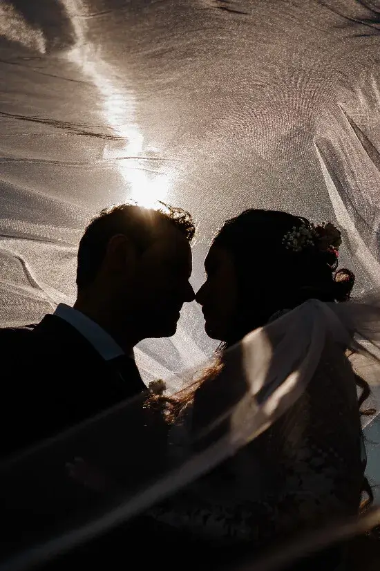
Removing colour changes what a photograph asks us to notice. A bright flower stops announcing its hue. A face, a hand or a patch of light can become more important. That is why black and white can feel so direct. It is also why a quick conversion does not automatically make a photograph stronger.
Look for separation before drama
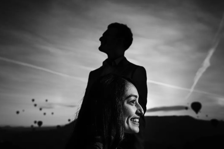
Ask whether the important shapes remain distinct. Dark clothing against a dark wall can merge, while a light dress and a bright background can lose their boundary. This is a question of tonal relationships, not simply adding more contrast to the entire frame.
Ufuk Sarisen’s monochrome portrait connects a face, a silhouette and distant balloons through brightness and placement. The viewer can distinguish those layers without colour doing the work. Notice where a pale edge separates one dark shape from another.
Let a gesture carry the frame
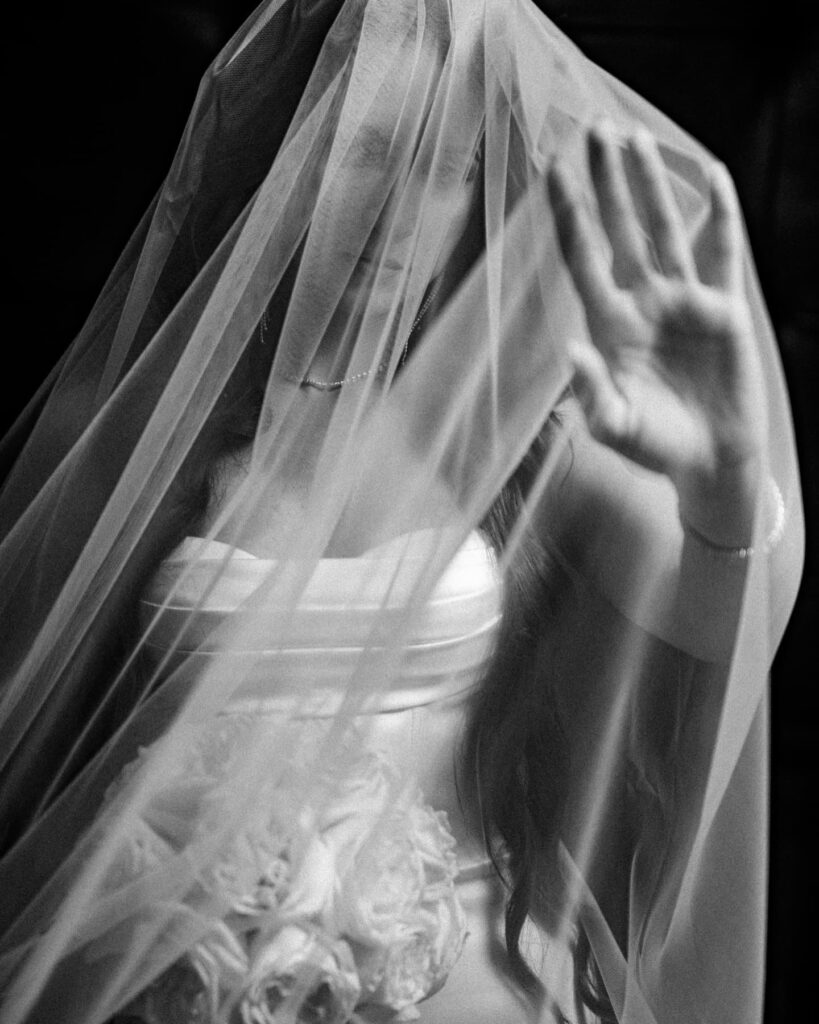
A strong expression or interaction rarely needs a dramatic editing treatment to become interesting. Study the relationship between the people and the light falling across them. If the gesture is already clear, a restrained conversion may preserve it better than very deep shadows or glowing highlights.
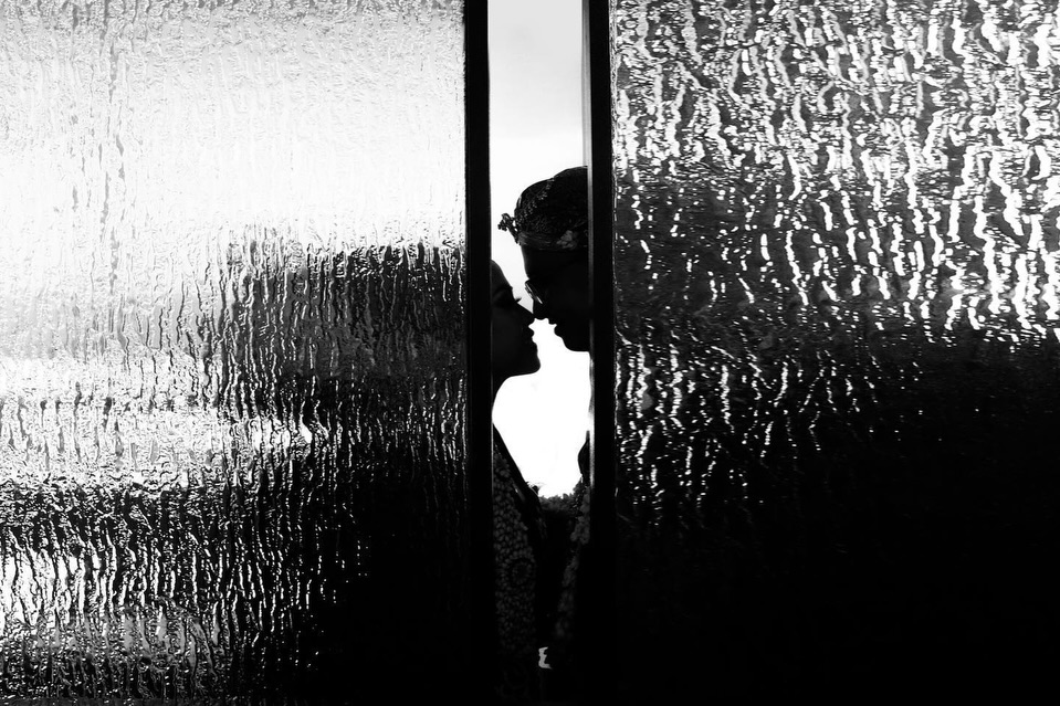
Oleg and Nataliia Semashko’s bridal portrait uses the veil and a hand to introduce texture and gesture. Paramount Photography’s image lets a bright opening define the couple’s profiles against patterned glass. Both are useful studies of separation; these are the authors’ photographs, not conversions we have made.
Compare versions in context
When editing your own work, keep the original file and compare the colour and monochrome versions at the same size. Check faces, fabric detail and the background. Then place the preferred version among the pictures that will surround it in the gallery. A photograph may work beautifully alone yet interrupt a sequence for the wrong reason.
Avoid using black and white as a universal rescue for mixed light, missed focus or an unclear subject. It can change emphasis, but it cannot recover information that was never recorded. The useful question is whether the change makes the photograph easier to feel and understand.
A good monochrome edit has a reason to exist. Sometimes the reason is a clear gesture. Sometimes it is the shape of a room. Sometimes colour simply adds less than it takes away. Make the decision picture by picture.
Keep exploring
For visual context, read our BM Weddings feature and our guide to framing.