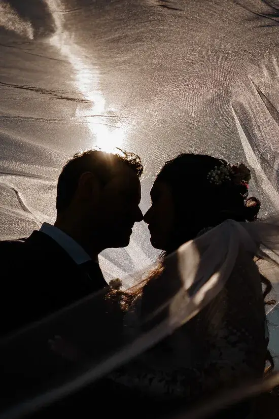
A building can become a shape. A doorway can become a line. Two faces can remain expressive even when most of their detail disappears. In these wedding photographs by Alexandr Korobov, light gives the image a structure before we begin to read its smaller details.
There is a pleasing economy to this selection. Each photograph has one visual idea we can recognise quickly, then a human gesture that keeps the idea from becoming purely abstract. Looking at them together is a useful exercise in asking what a portrait really needs.
A diagonal with two people in it
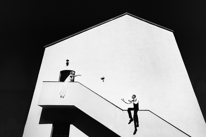
The white building and its stairway dominate the first photograph. Black and white makes the large shapes especially clear, while the figures give those shapes scale and purpose. The diagonal does more than cut across the frame: it creates a relationship between two positions.
Imagine the architecture without the people. It might still be graphic, but it would tell a different story. Then imagine the people without the architecture. Their placement would lose much of its tension. The interest comes from the two elements needing each other.
For couples drawn to this kind of picture, the useful request is not a particular staircase. It is a portrait in which the setting plays an active role. A photographer can look for that relationship in the venue you have, rather than trying to reproduce someone else’s location.
A little brightness can be enough
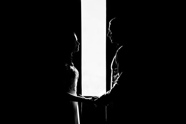
In the second photograph, a narrow vertical strip of light separates the dark space. The figures meet across it, and their hands give the eye something specific to understand. Much of the room remains unseen.
This is a strong reminder that a portrait does not have to describe every part of its setting. The hidden space can create atmosphere, as long as the important gesture stays readable. Here, the line of brightness and the connection between the people are enough to organise the picture.
For photographers, begin by identifying the gesture you want to preserve. A dramatic patch of light can be tempting, but it only becomes a portrait when the people have a meaningful relationship to it. Watch for an outline, a gap or a touch that remains clear within the contrast.
Keep the outline simple when the background is busy
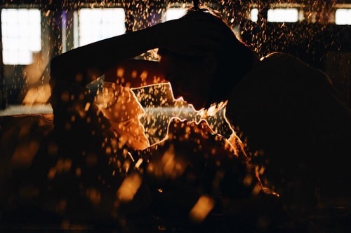
The golden photograph introduces a much more textured background. Small bright marks fill the scene, while the faces form a comparatively simple silhouette. That contrast lets the outline remain legible without flattening the atmosphere behind it.
A near meeting of faces can be more readable than a complete overlap. The exact distance matters visually, even when it is small in real life. It is the kind of detail that becomes obvious when you compare a few neighbouring frames rather than judging only one photograph in isolation.
Bring a clear idea, leave room for a person
These three images suggest a useful balance: simplify the visual structure, then pay close attention to the human connection inside it. A strong shape can invite us into the photograph. A gesture gives us a reason to stay.
Explore the original Alexandr Korobov carousel, then compare this selection with our guide to contrast in black and white wedding photographs. The aim is not to make every picture look dramatic. It is to make each visual decision count.