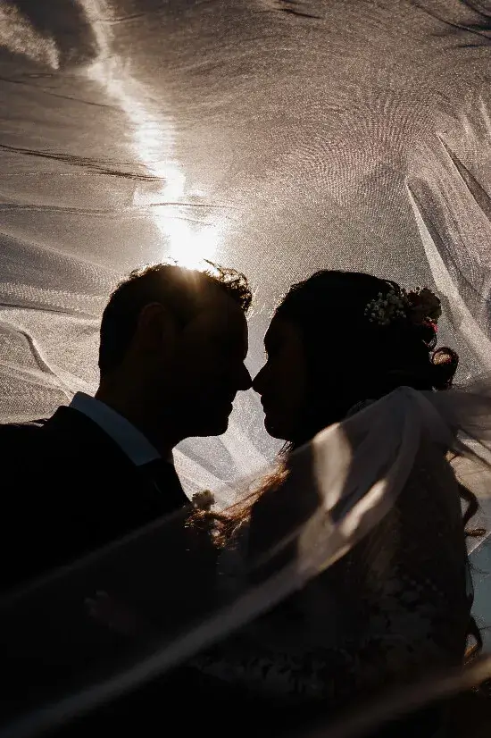
One red photograph can stop a scroll. A gallery needs more than a succession of red photographs to keep somebody looking. Colour can act as a thread through a wedding story, returning in different places and at different strengths. The interesting part is deciding when to make that thread obvious and when to let it disappear.
Notice what the day already gives you
Begin with actual surroundings: flowers, clothing, walls, invitations or the light in a reception room. Look for relationships rather than exact matches. A strong warm tone in one frame might return as a small accent several photographs later.
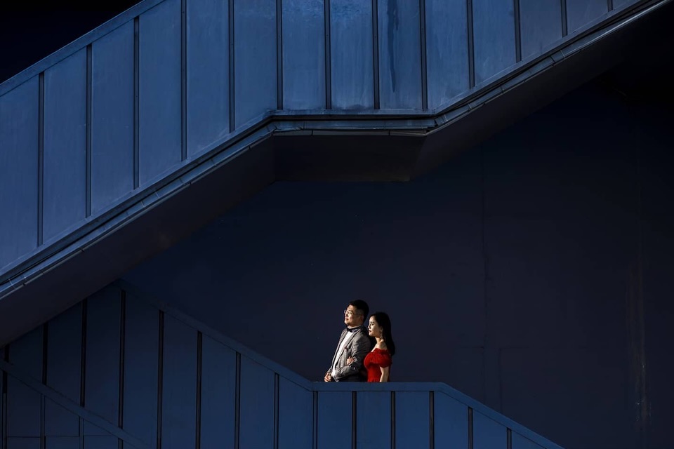
In Ufuk Sarisen’s architectural portrait, a small red accent sits inside a large field of deep blue. The colour contrast helps us find the couple rather than distracting from them. A palette supports a subject; it does not replace one.
Let contrast do some of the work
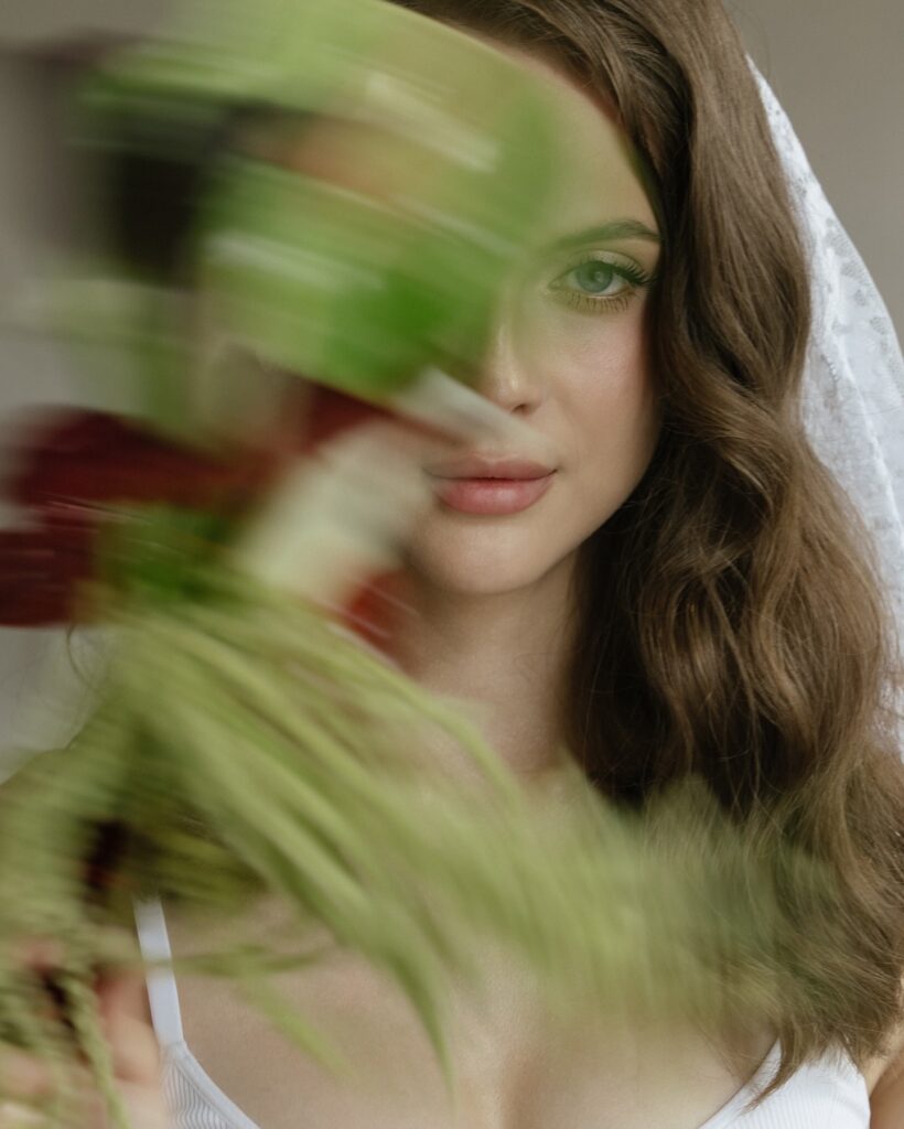
Victoria Monakhova’s bouquet portrait moves closer and introduces green and orange around a face. The visual thread can change scale like this: colour that fills the surroundings in one photograph may appear as a softer detail in the next.
You do not need to push every file toward the same tint. Skin, clothing and the look of a venue deserve careful attention. Editing consistency is useful when it supports a believable story, but a single treatment will not behave the same way under every kind of light.
Give the eye a place to rest
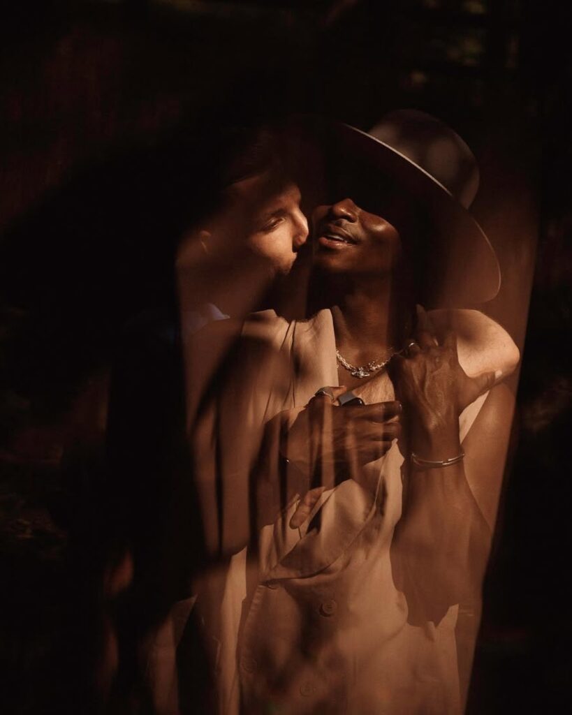
Radski Photo’s warm, layered portrait offers a more restrained change of mood. A gallery can breathe through quieter colour as well as through black and white. Compare the transitions rather than pushing every photograph toward the same tint.
Try laying out nine photographs as a small sequence. Include one strong colour statement, several pictures where the colour appears more quietly and one or two changes of mood. Then inspect the transitions. If every frame is shouting, remove an image rather than increasing the volume of the others. Cohesion can come from restraint as much as repetition.
Keep exploring
For more visual approaches, explore our César feature and Kimi & Smith Pictures feature.