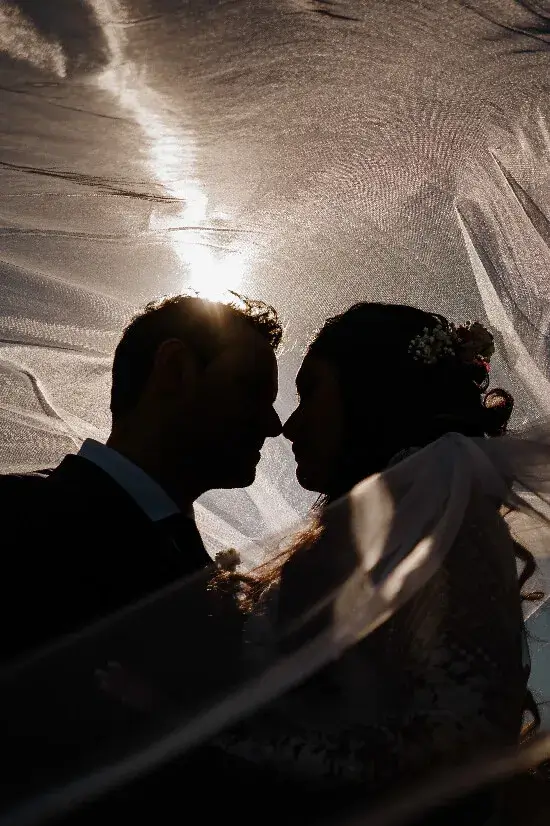
“We want photographs that look like a film.” It is a lovely starting point, but films can look like a quiet kitchen, a neon street or a sunlit road. Before collecting a hundred references, decide what kind of scene you would actually enjoy being inside.
Cinematic couple photographs do not need a complicated plot. They need a clear atmosphere and something for the people to do within it. The most useful reference is one that helps you explain a feeling, rather than one that demands a copy.
Name the feeling before the effect
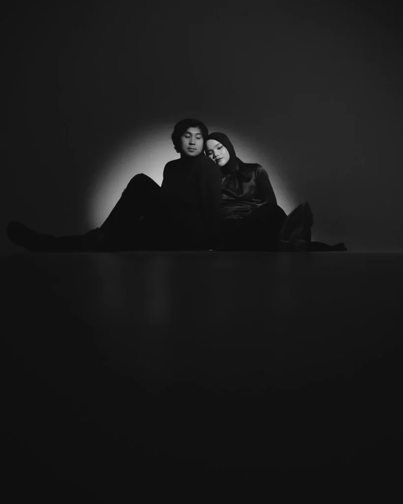
The seated couple in Diantara Jingga’s monochrome portrait share a small area of light. The surrounding space slows the image down. For another couple, that same stillness might feel too formal. Neither response is wrong; it is information for the session.
Choose three references and write one sentence beside each: “I like how close they feel,” “I like the warm evening colour,” or “I like that the location is still visible.” That gives the photographer something more useful than a list of filters to imitate.
Give the scene a small action
Walk to a doorway, stop to talk, lean together or look towards the same sound. An action can give a portrait a beginning and an end without requiring acting skills. Keep the direction simple enough that you can still pay attention to each other.
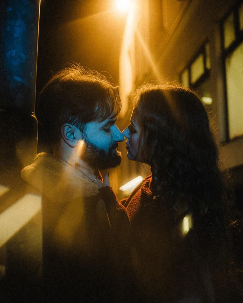
Jirka Votava’s street portrait combines a close exchange with warm light and the lines of the location. It suggests a scene beyond the edges of the photograph. A real street, with its signs and imperfect surfaces, can offer more character than a background stripped of everything familiar.
Let colour have a purpose
A coloured highlight can separate two faces or change the emotional temperature of a scene. Too many competing effects can make the relationship hard to find. When reviewing a reference, ask where your eye lands first and whether it returns to the people.
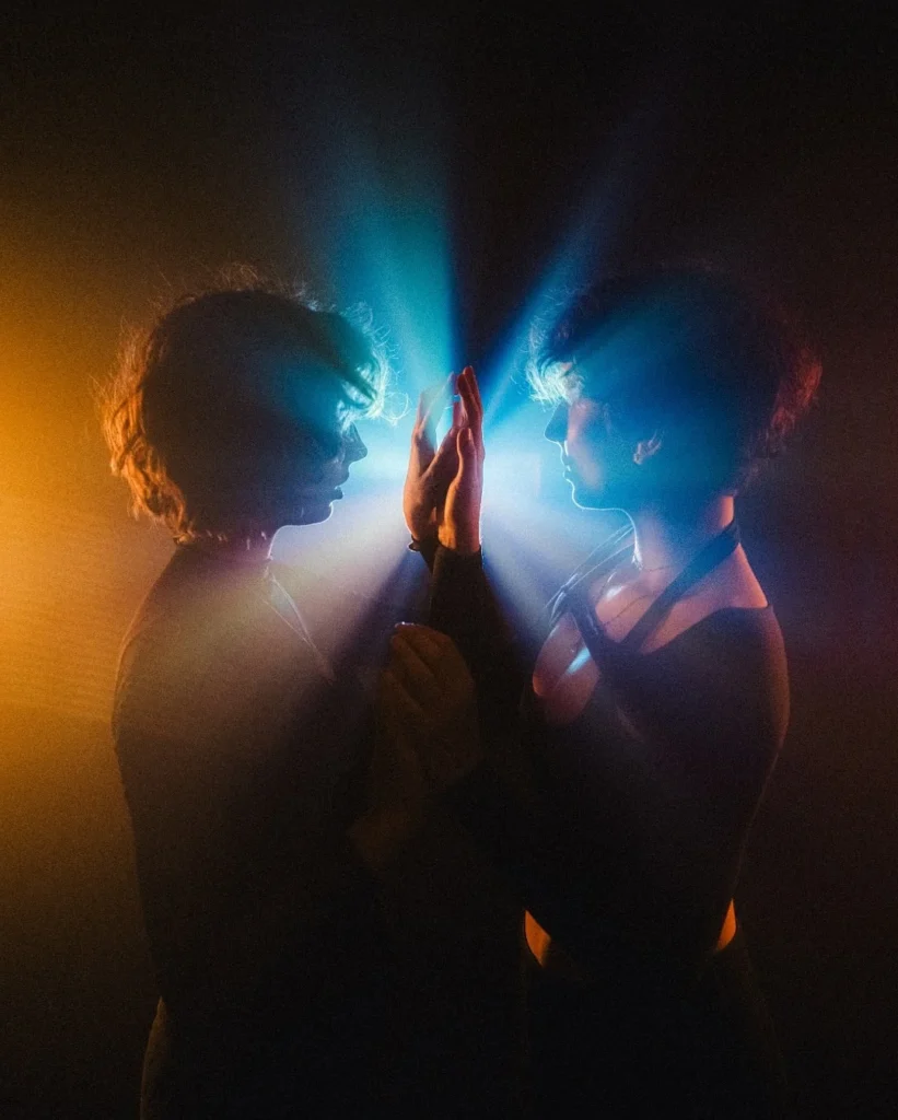
Here, contrasting blue and amber surround a simple meeting of palms. The gesture holds the picture together. We cannot tell every production choice from the finished image, and we do not need to: the useful lesson is the balance between atmosphere and a readable connection.
Make the brief fit your wedding
Discuss the time, the available light and any permission needed at the location. Ask for a few straightforward portraits alongside the experimental ones, so the gallery has different rhythms. If a planned setup starts to take over the celebration, it is fine to simplify it.
A small scene you enjoy will usually feel more personal than a grand one you endure. Continue with our guide to choosing a wedding photography style, or explore how colour can connect a wedding gallery.